
The Power of Data: The Move-In Move-Out Equilibrium, or Conundrum?
We continue in our series of blogs on the power of data. We looked in the past at the revenue per square foot of recent customer move-ins and customer move-outs. Analyzing the relationship between these metrics can provide useful insights into current market conditions and may even provide an early sign of changes in the market, allowing for earlier corrective action.
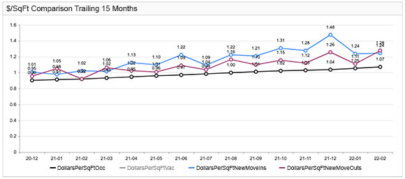
Centered on revenue per square foot, we look at the following:
- Customer move-ins.
- Customer move-outs.
- Occupied units.
Taking all the KPI’s together, we can observe the following.
Existing occupancy revenue per square foot steadily increases over time.
This is a good trend. In the graph above, because of its almost straight-line profile, it visually forms an easily digestible reference point for monthly customer move-ins and move-outs. If occupancy is holding steady, or even better, increasing, store revenues would naturally be increasing as well. Furthermore, note the above relationships could be analyzed more thoroughly at the store or unit size (e.g., small, medium, large, mega). For higher level views, you could also carry out store-group and portfolio level analyses.
In the above example, customer move-ins are at higher rates than the average rate for occupied units. This serves to “lift” the occupied units trend line. Although customers are also moving out at rates that are higher than the average rate for occupied units, the move outs are generally at rates that are lower than the move-ins.
The overall result of the two forces nets out to an overall increase of occupied units over time. Unless occupancy is dropping at a faster rate, revenue production by rentals is improving.
For the trend line to increase, and assuming stable occupancy, customer move-ins need to be at rates that are higher than customer move-outs.
Remember, these KPIs are in revenues per square foot. A smaller unit may yield less rent per month than a larger one, even though it may be greater on a per square foot basis. Which is why carrying out the above review for similar sized units can be most informative.
In the graph above, we see that there are three months where the average rate per square foot of move-outs exceeded that of move-ins: January 2021, March 2021, and February 2022. These are important months to consider, because these are the months that could be exerting greater downward pressure on the overall occupied units trend line. In such situations, it becomes even more important to consider occupancy changes.
A focus on winter months?
We note that all three months are in the first quarter. Demand during winter months may be reduced. If so, the “upside down” rate comparison may be appropriate, and may even be expected, especially if it is helping to maintain or build occupancy during these months. However, if occupancy is increasing “too much,” you may consider whether you are:
- leaving end-of-year holiday specials for too long;
- offering move-in concessions too frequently or too aggressively.
Furthermore, to reduce customer move-outs, we have discussed in a previous blog whether for the winter months, are price increases too aggressive and causing move-outs in unit groups that have significant vacancies.
The Power of Data.
Move-in move-out equilibrium, or conundrum? By proactively looking at the data and taking relatively small, targeted and disciplined price adjustments, you can “build” your existing occupied revenue per square foot upwards. You can see how this trend line, over a relatively short period of time, can increase your overall revenues dramatically.