
The Power of Data: Understanding New Customer Move-Ins
In a past blog, Key Performance Indicators (KPIs), we highlighted an example where a self-storage operator experienced relatively stable occupancy for the past 18 months. We highlighted several core KPI’s of especially strong interest based on revenue per square foot.
Revenue per square foot (when based on total square feet of a facility) is often a good, and easily understood metric. Because it “normalizes” revenue, it is often a much more robust metric when comparing revenue across stores of varying sizes as well as for trend analyses, as stores can vary in size over time. In this blog, we consider two aspects of revenue per square foot:
- Based only on occupied units.
- Based on move-ins (i.e., new customers).
(We will discuss other metrics in future blogs.)
Of course, understanding the rates at which new customers move in is always important. But what does that really mean and in what contexts are such data insightful?
The power of visualizing data.
By plotting different metrics together on a single graph over time, we can quickly visualize not only a single trend over time, but the relationships of the metrics over time. The graph below highlights the relationship between revenue per square foot of occupied units and of move-ins from December 2020 to February 2022.
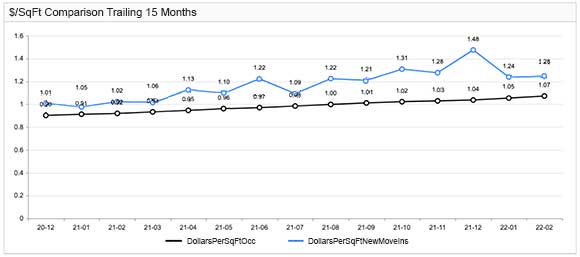
We can observe that revenue (per square foot) for move-ins, regularly exceeds that of occupied units. This is a good thing, as the operator is consistently obtaining higher rents from new customer move-ins, relative to current customers.
Why is this important?
For one thing, it suggests that there may be opportunities to be more aggressive when raising rents on existing customers. Furthermore, if overall occupancy is stable or growing, it suggests that the market is strong and overall revenues are increasing. By looking at similar graphs for different unit sizes (for example small units, medium-sized units, etc.), it is possible to better understand market demand at a more detailed level and respond accordingly.
Learning from the data.
Now, let’s look for seasonal patterns. Notice that in January 2021 and January 2022, new customers appear to pay less than the month prior. If this pattern repeats every year, you should consider the following:
- Is there a “valid” reason that rates appear to be lower in January than December?
- Is there a pro-active pricing action that could be taken to mitigate such decreases?
- Are end-of-year holiday specials being left on too long?
- Are prices dropped too much as a reaction to fewer move-ins occurring during the beginning of January, perhaps due to the New Year’s holiday?
Visually seeing the repetition in reduced rates in January suggests that a deeper dive into the data may be warranted so that appropriate “corrective” actions might be identified.
Similarly, was the July 2021 reduction an anomaly or is there also a recurring trend that we should be aware of? Seeing how July 2021 behaved might lead to discussions among the senior management team about what needs to be considered in advance of July 2022.
Pricing actions that lead to revenue increases often impact net income much more significantly than gross revenue. Consequently, having a pricing analyst or someone on staff that has the time and capabilities to ask questions and “mine” the data to identify trends often enables profit increases far beyond their cost to the organization.
It is easy to see how just two types of data, move-in and occupied revenues on a per square foot basis, can tell a lot. By understanding and investigating the data, operators can better assess performance, and even more importantly, better differentiate between what is “normal”, and what is an anomaly. If it’s an anomaly, operators can proactively manage their revenues rather than waiting for the anomaly to become an emergency.