Occupancy Adjusted New Customer Move-Ins
Special thanks to co-author Kevin Bowman, Managing Director, Revenue Management at StorageMart. Based in Columbia, MO, StorageMart operates over 200 facilities in the US, Canada, and UK.
In our previous blog, The Power of Data: Understanding New Customer Move-Ins, we talked about measuring new customer move-ins in revenue per square foot. Here, we take another look at this key performance index (KPI), but as it relates to existing occupied unit percentages.
Utilizing this relationship, we have another way of ascertaining whether we should be pricing new customer rents in in a more profitable way. However, let’s first get some context.
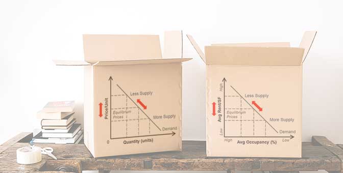
The Law of Supply and Demand
The “law” of supply and demand is really a theory. But one that is extremely useful and practical. It explains the pricing relationship between sellers of a product and buyers of that product. In our self-storage case, the sellers are the self-storage operators offering storage units for rent. The buyers are customers that are looking for storage space to rent.
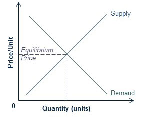
The graph above shows two “curves”. We draw the curves as lines for easier conceptual illustration. The curves represent two “laws”, the law of supply, and the law of demand.
The supply curve shows an upward trend. From the seller’s perspective, if a product can be sold for a higher price, the more product the seller will make and offer. As a store operator, wouldn’t you wish to have more of those specific, highly profitable units to rent?
However, the demand curve is the opposite, and trends downward. The higher the price of a product, the fewer the customers will demand that product. Or, in other words, the lower the quantity of product demanded. Conversely, the lower the price, the more customers will be willing to buy the product.
The intersection of these opposing curves is the equilibrium. This is the price customers are willing to pay and sellers are willing to take.
A stable customer demand environment.
In this particular application, we will only be using and analyzing Customer Move-In data for markets where customer demand is stable. As you can see from the graphs below, the downward sloping demand curve remains the same.
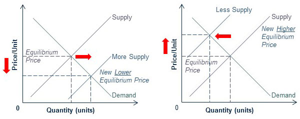
However, as an operator, your available units for rental will vary. In other words, your “supply” will vary. As you see in the graph on the left, the more supply you have, the more willing you are to rent at a lower price. The opposite is true when you have less available units, or less supply.
The supply curve shifts depending on how much supply you have.
Note: Value Pricing spearheaded by Veritec Solutions essentially shifts the demand curve upward on the graph, yielding higher rental prices, and hence revenues, for the operator.
What is your demand curve?
The graph on the left below shows the demand curve. You are basically traversing the curve based on how much supply, or available units, you have to rent.
The graph on the right is an application specifically for self-storage. On the vertical axis, you have “Average Rent per Square Foot” (for new customers). This is the same metric we discussed in our earlier blog. The horizontal axis is the Average Occupancy Percentage of all available units. Note that the higher the Average Occupancy, the lower the supply, and vice versa.
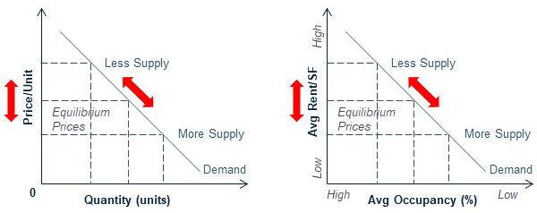
By plotting your Average Occupancy to Average Rent per Square Foot (of new customers), you will be constructing your own curve. Keep in mind the following:
- Such an application only works in stable demand markets, not in highly competitive or volatile markets.
- The curve will likely be not straight.
- You plot curves for units with the same attributes. For example, “non-climate controlled units between 80 and 150 square feet”. In other words, make sure you are comparing “apples to apples”.
Once you plot your curve, you will likely notice outliers. Here is where the analysis begins, such as whether you could have prices a unit higher, whether you have seasonality, whether you can “shift” the demand curve upward, and so on.
By addressing the outliers, you will have a better understanding of the market dynamics that affect your pricing, your pricing reaction to the market, and what you can do to further increase your revenues. Stay tuned, as in a future blog, we will examine some actual data.